With MarsManaged edging closer to feature-complete, today I took some time to start iterating over color palette & icon concepts.
First, lets talk about the palette:
The premise of the app is that you’ll be as productive as future martian generations will be. With that in mind, when it comes to the color palette of the app, I wanted to start with something Blade-Runner like…
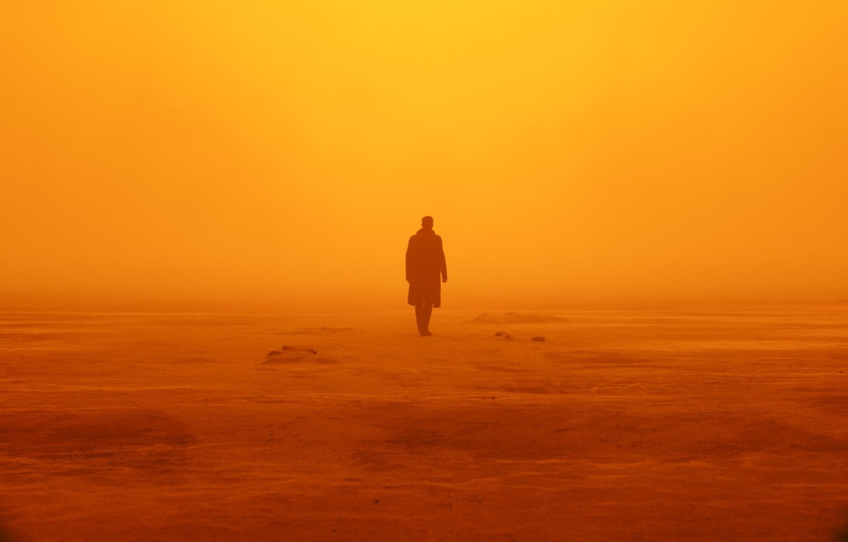
That gives me a combination or oranges and dark grays to work with. There will be cascading problems from this decision, but that’s for another post, for now let’s move right along.
Designing the first icon:
For inspiration I really liked the image of someone looking over a planet. Something like this:
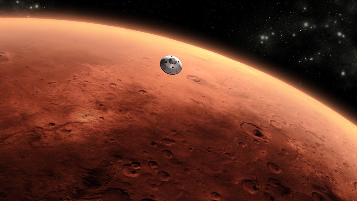
From there I dusted off Cheetah3D and PixelMator Pro and got to work on putting something quick & dirty to start with.
First was the spaceship, a very basic spaceship with some lighting effects would do the trick. The key here, given we’re testing ideas, is to not spend too much time.
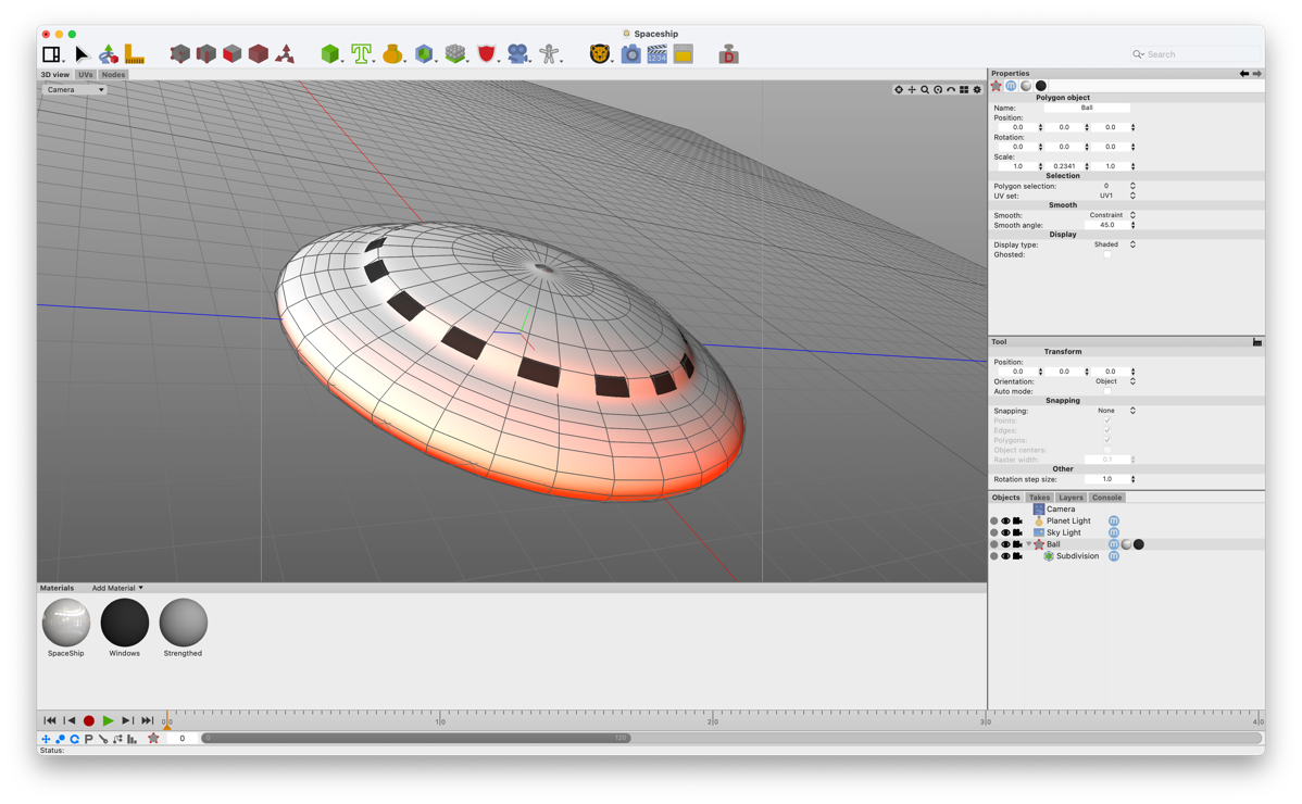
I’m adding some lighting and reflection so it looks like its orbiting a planet with an orangish atmosphere.
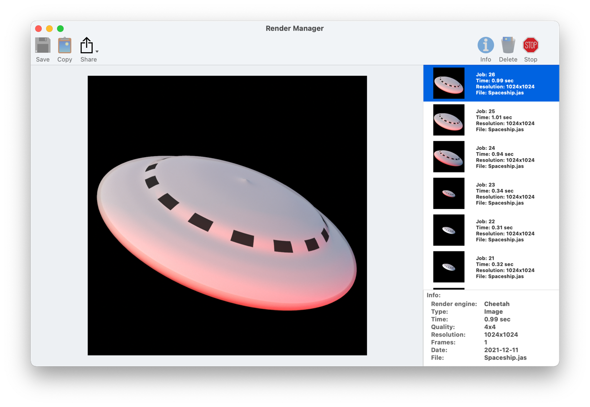
From there, in Pixelmator I created background using a gradient and some effects to make it look like a planet surface (I settled on something between Mars and the Sun)…
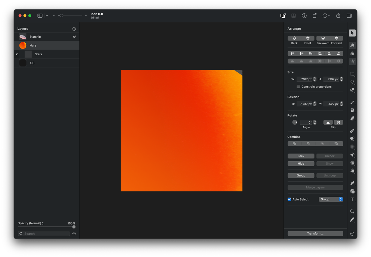
And then I added the spaceship on top of it.
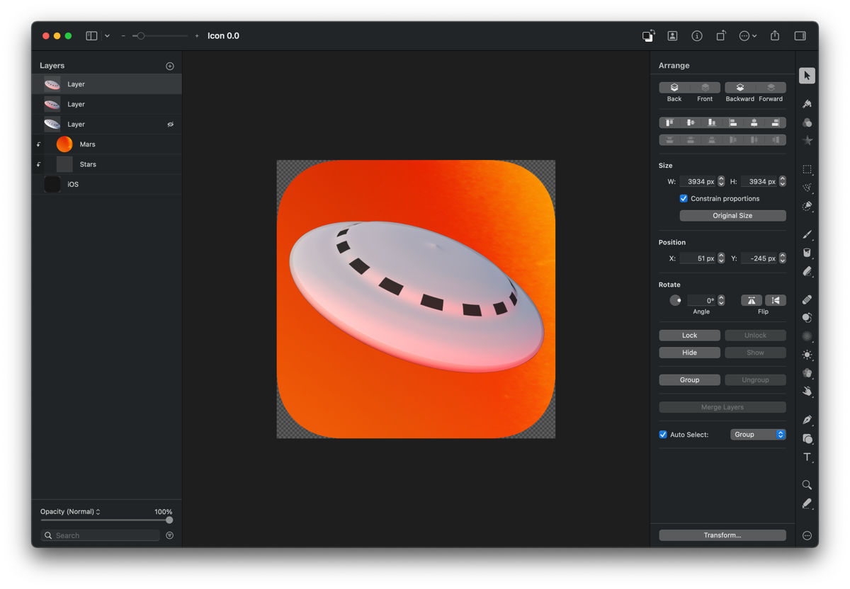
And that resulted in the first rough iteration of the icon.
At this early stage it’s all about testing ideas and iterating quickly.
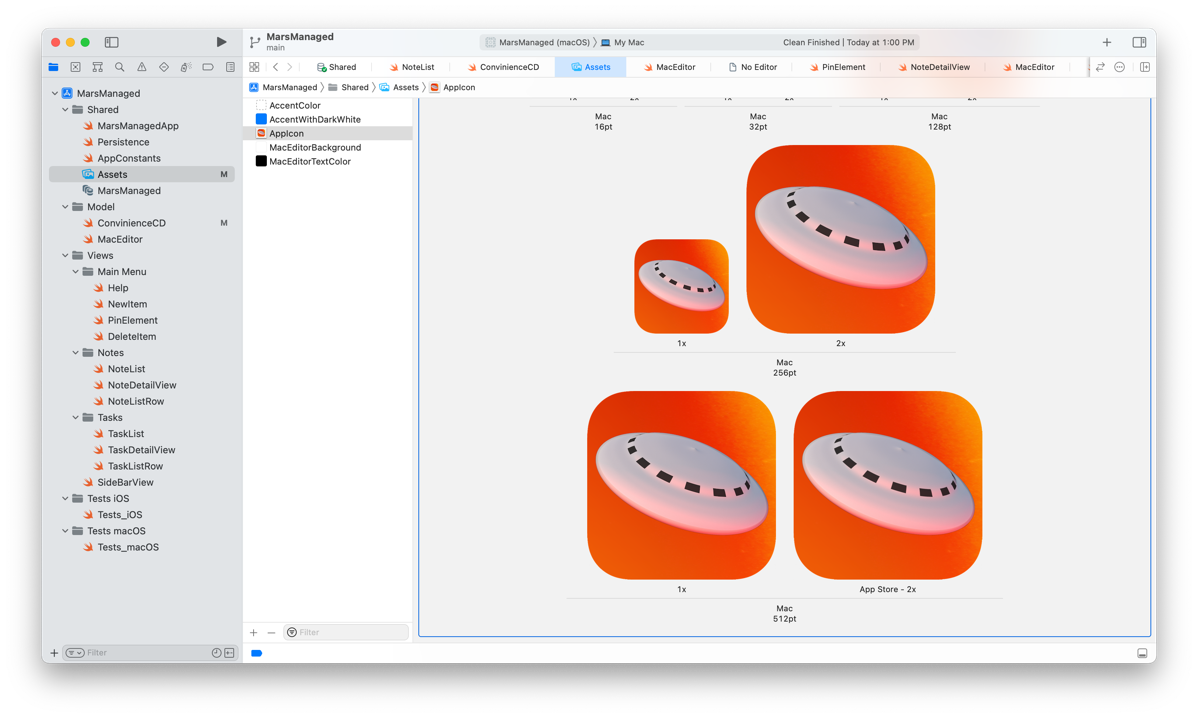
I’m on the fence between going for something fun, using renders, or going for a more serious/flat design…

Given the target audience, I’m thinking it should be the latter or a combination of both.
Will take a couple days to think it through and start on the next iteration, let me know your thoughts / suggestions @MarcMasVi
Until next time,
Marc