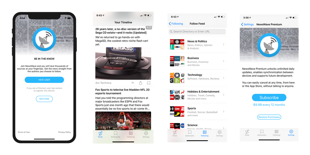
There’s many things that have changed since social distancing began about 15 days ago: meeting friends, going for morning coffees, weekend escapes and many other activities are now on hold. However, there are also some positive consequences: my wife and I have really gotten into board games (Forbidden Island, Exploding Kittens, Scrabble…), I’ve gotten a lot better at cooking and, probably the most relevant for this blog, I have significantly more time to code on weekends, so… NewsWave 2020.1 is now live!

NewsWave 2020.1 is a major update. In a nutshell it improves the onboarding experience and builds the foundation for the upcoming macOS version.
Here are the key changes in a bit more detail:
1. Onboarding:
This was the area the app that needed more work on and I’m very happy with the result. To recap, this is how it used to work:
“when you launch NewsWave RSS for the first time, you’re asked to create an account or restore an existing one before you can interact with the app. For privacy & simplicity reasons I do this with a free IAP. Behind the scenes, when a user unlocks a free in-app-purchase (IAP), Apple provides me with a uniqueUserId I use to identify the customer. This allows me to grant the customer a 30 day free trial, allow him to try sync and easily migrate him to a Premium account if he so chooses. “
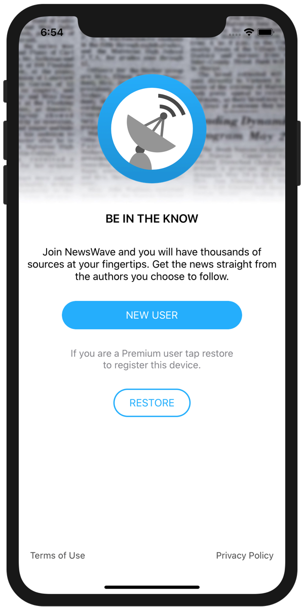
The new model is much simpler, users can create an anonymous account with the click of a button. When a new user downloads NewsWave, a new device-specific token is created for him, no emails, no IAP, no complexity.
You may have spotted a significant downside vs. the old model. As the identifier is tied to the device, and because there’s no personal information shared, if the user deletes the app the device-token is gone too. What this means in practice is that if the user re-downloads the app, he would need to create a new account.
Wow! Big downside. Well, yes, and no.
Once the user becomes a subscriber, his device token is linked to the in-app-purchase (IAP) identifier. From then on he can restore his account from any device by tapping “Restore”. This is true even if the user is no longer subscribed.
Therefore, the only time this could lead to a potential challenge is for users trying the app. Given that it’s only 30 days, and that they would need to remove the app, I’m confident the upside is a lot more significant than the potential downside.
A final consequence of this changes is that the onboarding UX is significantly more streamlined. Here’s the new page:

I believe there will be significant impact on conversion-rate, which was the key challenge of the app in the past. I’ll keep you posted on how it changes.
2. Default Feeds:
In the old model, once a user had created an account, they were taken to the “Feeds Section” and guided to start adding feeds. This was not a great first experience, and if the user tapped away from the “Feeds Section”, he would not be able to interact with anything as there was no content to show… Not great.
In the new model, when a new user is created, he is automatically subscribed to a few starting feeds. Once the initial setup is complete, he is taken to the main screen -already populated with content- where he can start using the app. A huge improvement vs the past.
This change resulted in something else, I had to choose these starting feeds.
Default feeds should:
– Touch a variety of fields/subjects.
– Be free to access (or have generous free access policies).
– Provide a good RSS summary and image to go along with the posts.
– Post enough but not too much, ideally 5 to 20 times per day.
– Represent both mass appeal and niche feeds.
Here’s what I settled on:
1. Daring Fireball (Blog – Apple)
2. Six Colors (News – Products/Apple)
4. Ars Technica (Technology)
5. Vox (General News)
6. Mr. Money Mustache (Blog – Personal Finances)
7. The Intercept (General News & Reporting)
3. Synchronization & under the hood improvements:
It’s no secret I’m working on the macOS version of NewsWave.
To prepare for its upcoming release, I’ve invested a lot of time on refining synchronization between devices. All calls now use one streamlined framework, which makes testing a lot simpler and reduces the likelihood of bugs.
Finally and most importantly, today both iOS and the macOS versions of NewsWave share the same API back end code, this dramatically simplifies the effort needed to update and improve the apps.
4. Other improvements:
There’s been many other refinements and under the hood improvements, including:
– Improved wording on several menus and notifications.
– Improved saving & loading speeds for users with large amount of feeds.
– Removed redundant code (I love this part, love it!).
– Fixed a bug that, under rare circumstances, could show a black NavBar.
– Updated Feed Recommendations.
I’ll be monitoring the servers to make sure everything is going well. With this milestone out of the way, I’ll be fully focusing on NewsWave for Mac from now on. Hopefully will be able to ship sooner than the original 2020 plan 🙂
I believe this will be a great year for RSS, if you’re not yet a user give NewsWave a try! And if you don’t like it, there’s other great options out there.
Stay safe & until next time,
Marc
—-
Twitter -> @MarcMasVi