One of the things I like about working on on-the-side projects is that I touch all aspects of them, this allows me to learn and grow many different skills. It’s so rewarding to learn about app development, server-side development, marketing, communication, design…
And it’s the latter one I wanted to touch on for this post, specifically the NewsWave App Icon. Before we begin let’s clarify something very important: I’m not a Designer (as it will soon become aparent).
With that out of the way, lets see how the previous NewsWave for iOS icon looked like:
![]()
What defines success for an app icon you ask?
– Should be easily recognizable on your iPhone home page & when it appears smaller for search or notifications.
– Should look great when it appears in large size, like above.
– Should work as a tab-bar icon (iOS) or a sideBar icon (Mac) with minor tweaks.
The NewsWave 1.0 icon -shown above- met the objectives #1 and #3, but when it came to #2 it was decent at best. For the upcoming release of NewsWave for iOS & Mac I wanted to have an improved version, so I got to work…
I knew what I wanted to keep: the antenna metaphor and a color combination of blue & gray. I also knew what had to change: the antenna was bland, specially when seen at large sizes, and the icon did not translate well to the mac.
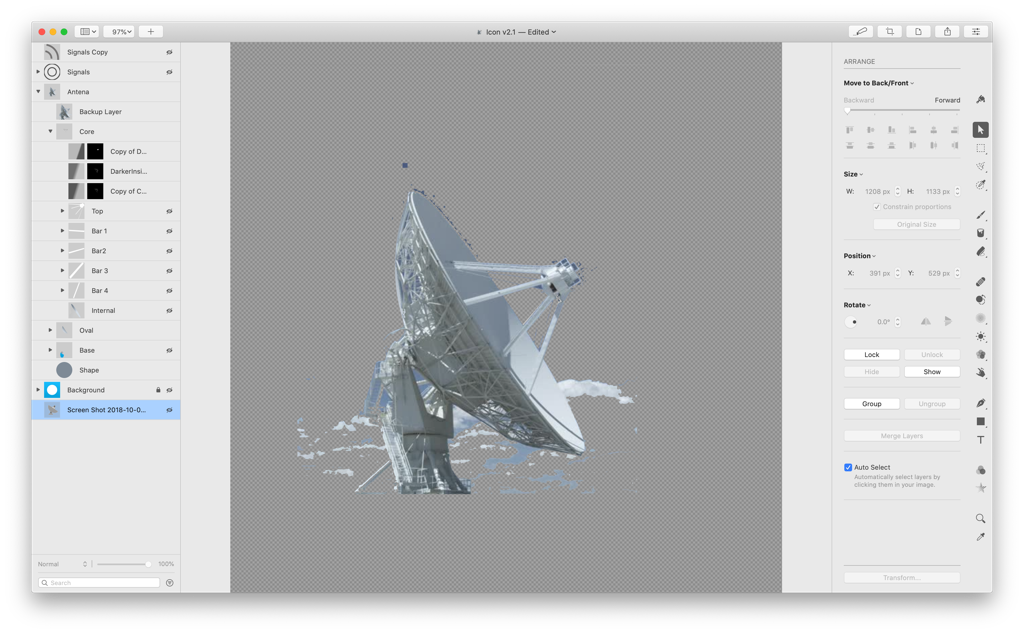
The first thing I did was choose a picture I could use for inspiration, here’s the ‘cleaned’ one I settled for:
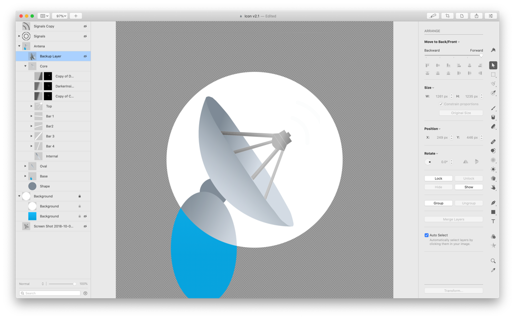
Once I had that, I worked on a first rough version of the icon:
and added background & other distinctive features:
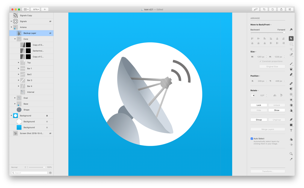
As a first iteration I liked it OK, but it was quite bland. So, I started iterating with different gradients, antenna inclination angles, shadows, distinctive features…
After every iteration I would load it in the App bundles so I could see how they appeard on my Mac and on my iPhone. Would also look at how they looked when using Spotlight, notifications, etc… This step is critical because something that looks great at large size may look awful at small sizes.
Here’s an example of another iteration, I knew it looked wrong but was difficult to know what to do to fix it.
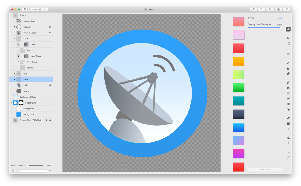
When you’re in this iteration circle, sometimes it can feel like you’re not moving forwards but backwards… Going for a walk or working on something else for a while helps big time.
And after one of this walks it hit me, what if the icon represented an antenna at night pointing at the stars? This led a series of follow up decisions: removing borders, adding a representation of the ground, changing colors, adding new filters… And very quickly got to the final version, for Mac:
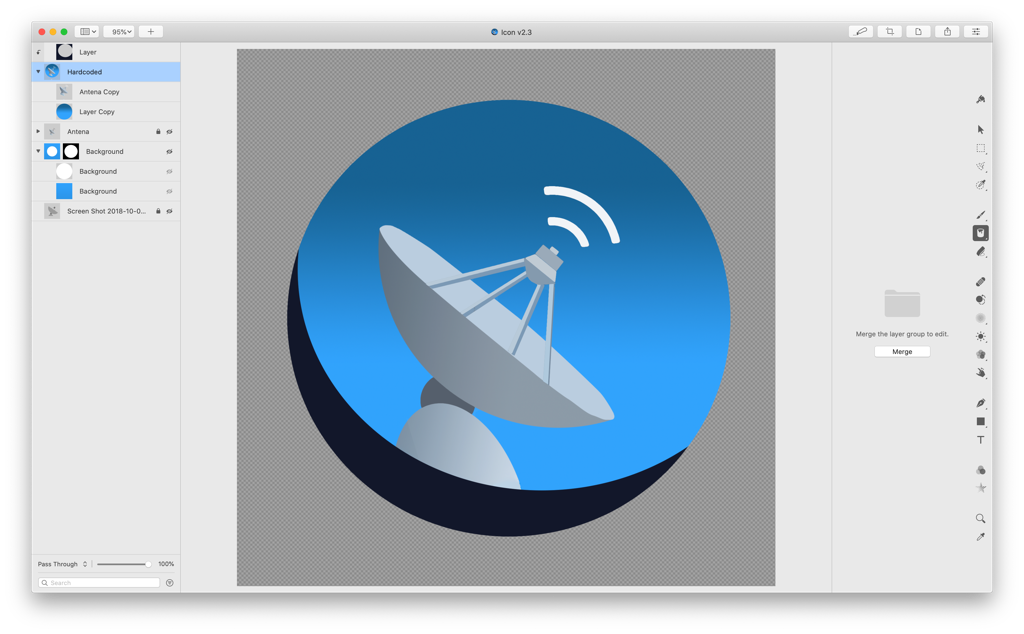
and for iOS:
![]()
I’m quite happy with how they turned out. At the same time I know there’s a lot that a full time designer would do better, and that’s one of things I love about this one-man-operation, you just keep learning & getting better.
As for the software I used to create the icons, it’s “Pixelmator Pro” and I can’t recommend it enough.
Comments / questions? You can reach me @MarcMasVi on Twitter.
Until next time,
Marc