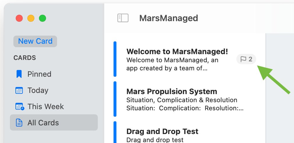
As I was working on cell badges indicating the number of to-dos pending for a given card it hit me…

The approach I was taking was good, it gave relevant and timely information…

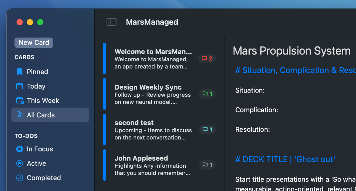
But could be much better: what if the flag changes color when you have a to-do overdue, due today, tomorrow or soon?
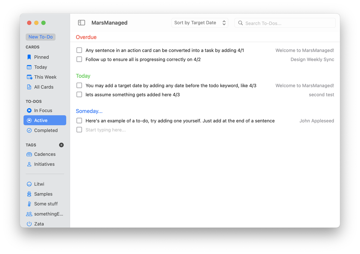
This would, without increasing complexity, add context and allow the user to focus on what matters. Furthermore, I could use the same split & colors already in use for to-dos, making it extremely accessible:

Got to work, and a couple hours later, voilà:

Quick aside for interested fellow engineers, this is pure SwiftUI. When the cell is loaded, a model helper function determines the number and color of to-dos. SwiftUI takes care of the rest and dynamically shows the right thing.
Finally, if no to-dos exist for that card, no badge is shown. So, if you see no flags, you’re all done!

* * *
Here it is, in all its glory:

* * *
On a side note, although I believe this to be a better experience for most users, some may prefer a cleaner aesthetic. For them I’ve added a preference toggle so they can disable them.

* * *
At this point the app is almost feature-complete, I’m fully focused on polishing towards alpha -a very polished alpha that is-. If you’d like to be part of the test group do drop me a line at contact@mmvsolucions.com, would love your feedback.
Until next time! Thoughts, suggestions? Reach me @MarcMasVi
Marc