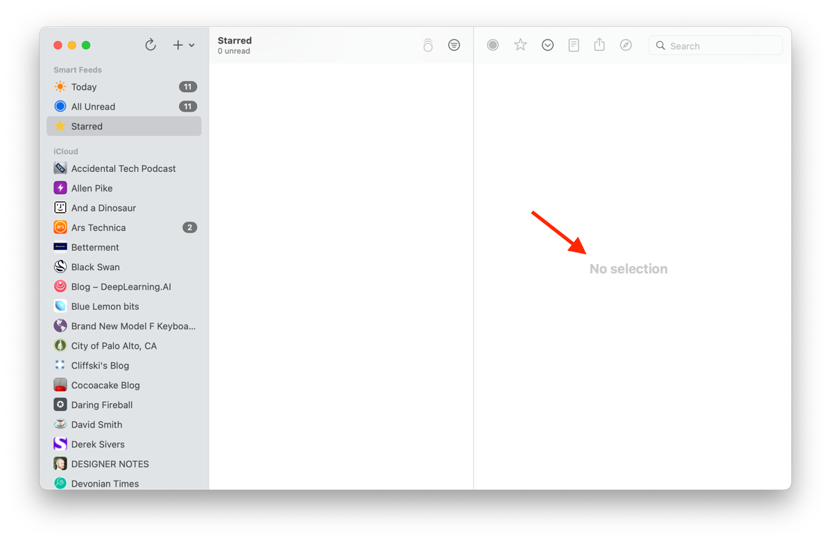
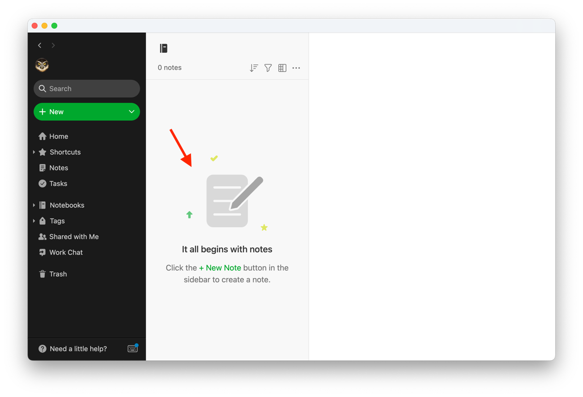
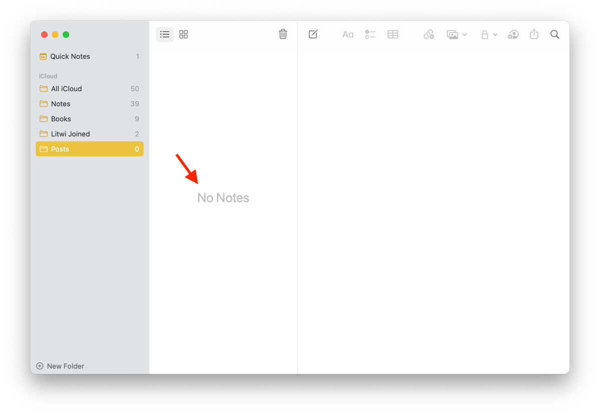
Empty states. Or to put it another way, what do you show when a view is devoid of any content?
This is an area that not all apps account for. The ones that do though, not only improve the end-user experience but also feel more… complete?
Here’s some examples of empty states.
1. NetNewsWire (a great RSS reader that I use daily):

2. MarsEdit (my blogging app of choice):

3. Evernote has a different style, showing also an image and a button to trigger next steps:

4. Finally, here’s how Apple Notes approaches it:

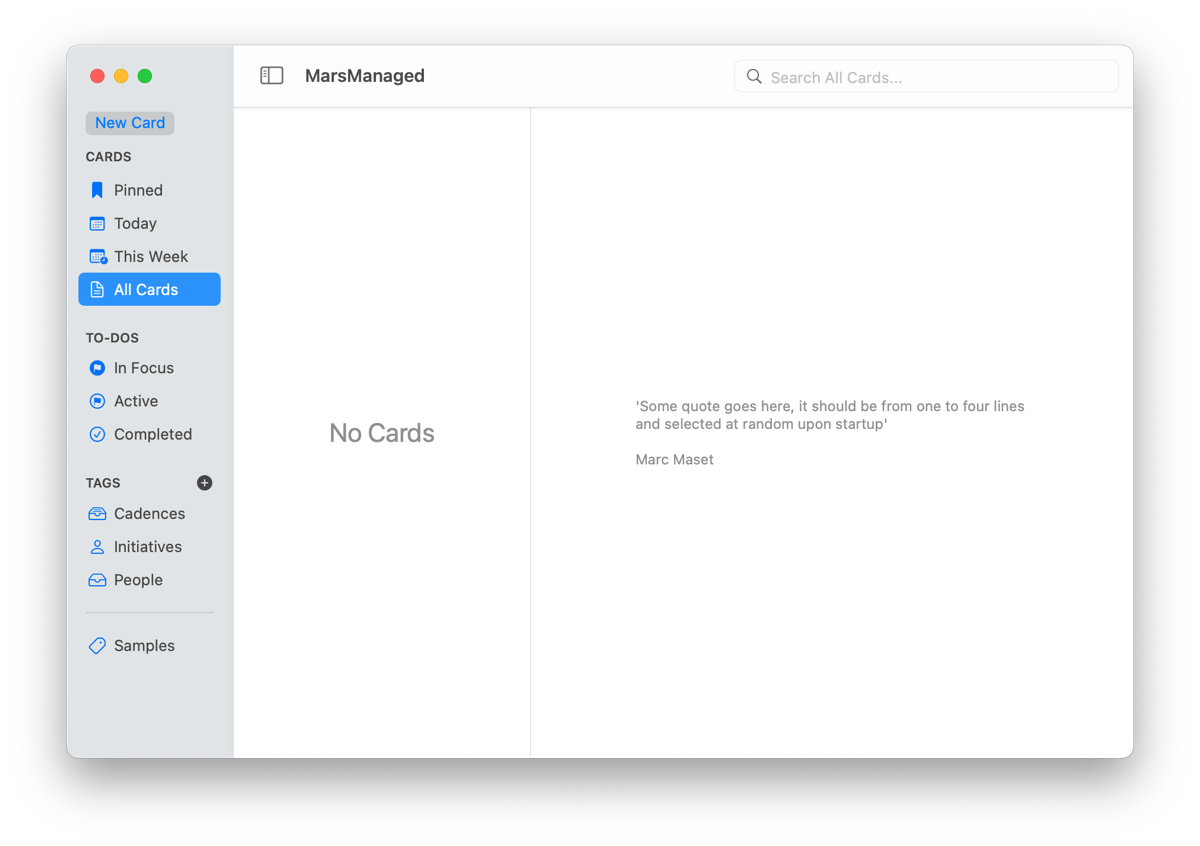
For MarsManaged I decided to go with a similar approach to Apple Notes when the card list is empty. Here’s how to easily do it in SwiftUI.
1. Create a ZStack where you’ll have a list of items you want to show followed by your desired empty state view, in this case I’m using Text.
2. Set the State View opacity to 1 if there’s no data to show or 0 otherwise. In doing so the view will only appear when there’s nothing to show.
ZStack{
List(){
ForEach(notes){note in
//Stuff […]
}
}
Text(“No Cards”)
.font(.title)
.opacity(notes.count == 0 ? 1 : 0)
}
In addition, to help infuse some character into the app I’m planning on having quotes related to space exploration/mars in the detail view. Maybe also some image of Mars? Have not decided yet… Do let me know what you think.

Development-wise it’s even easier: using an if statement it checks if a Card is selected and if so it’ll show the editor, else it’ll show the empty state view.
Thoughts, suggestions? Reach me @MarcMasVi
Marc