Back in Sunny California!

Portugal was great: the food, the weather, the people… In between hikes, museums and reading breaks I’ve done quite a bit of progress on MarsManaged: it’s looking better and better. Every day a bit more polished and user feedback is helping raise the bar big time.
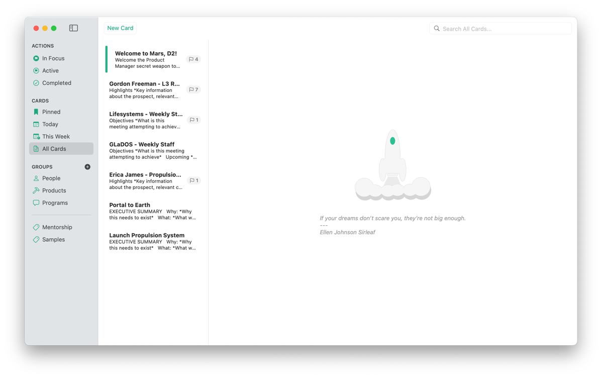
Here’s how the main screen looks like now:

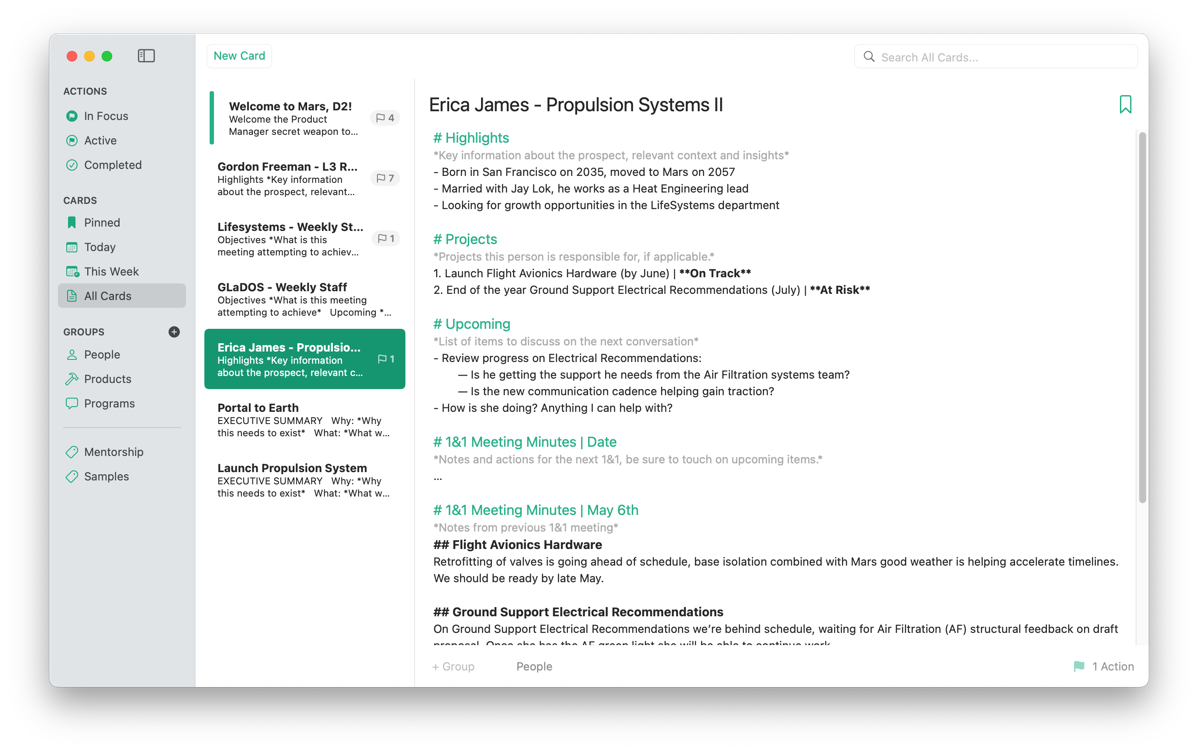
And here’s how it looks when a Card is selected:

Finally, as you may recall previous attempts were not satisfactory (to say the least) here’s the latest iteration of the icon:
![]()
If you want to be part of TestFlight and help shape the future of the app, drop me a line at contact@mmvsolucions.com
Thoughts, suggestions? Reach me @MarcMasVi
Marc