TextField Recommendations / Autocomplete – SwiftUI macOS and iOS

Another weekend, another set of improvements for MarsManaged. This time, I focused on adding an autocompletion feature for Tags.

Let me provide some context first… In MarsManaged, cards may be linked to one or multiple tags. In the below example, the “Welcome to MarsManaged!” card is linked to the tag “Samples” (yellow arrow). 

Screen Shot 2022 03 20 at 8 18 10 PM

To link one card to more tags, a user can start directly typing on the “+Tag” TextField. Once the user presses enter, the system will either link it to the right tag or —if it does not exist— create a new one and link it. 

To streamline the process, I wanted recommendations to start appearing once the user started typing.

– The bad news is that there’s no built-in SwiftUI methods for it.

– The good news is that by leveraging .onChange and .popover you can get the same functionality:

AutompleteExample

Here’s the section of the code that generates it:

@State private var popupTagsPresented = false


TextField(“PlaceholderText”, text: $variableLinkedTo)

.onChange(of: variableLinkedTo, perform: { newTag in

    //Do something with new tag to know when you want to show or not the popup, here assuming always

    popupTagsPresented = true

})

.popover(isPresented: $popupTagsPresented, arrowEdge: .top) {

    let filteredMatches = [“some stuff”, “somethingElse”]//Array of items to show (likely you’d grab it from Core Data / some model function)

    VStack(alignment: .leading, spacing: 4){

        ForEach(filteredMatches) { suggestion in

            Button{

                //When user clicks on the suggestion, replace text with suggestion and process it

                variableLinkedTo = suggestion.name

                processText()

            }label: {

                Label(suggestion.name ?? “”, systemImage: “someIcon”)

            }

            .buttonStyle(.borderless)

        }

    }.padding(10)

}

The above code uses .onChange to detect when the user starts typing in the TextField and flips the popupTagsPresented to true, which in turn shows the popover. 

The popover then displays the array of suggestions, each of them being its own Button. When a suggestion button is clicked, the TextField text is replaced by the selected suggestion and a function processText() is called. For my use case that function will link the tag to the card and then reset the TextField to nil so it’s ready to take new user input. 

Screen Shot 2022 03 20 at 8 35 44 PM

Happy Coding! Thoughts, suggestions? Reach me @MarcMasVi


Marc

MarsManaged March update, Alpha coming soon?

Lots of progress the last couple of weeks, the first alpha should be ready… Soon? 

Hard to predict.

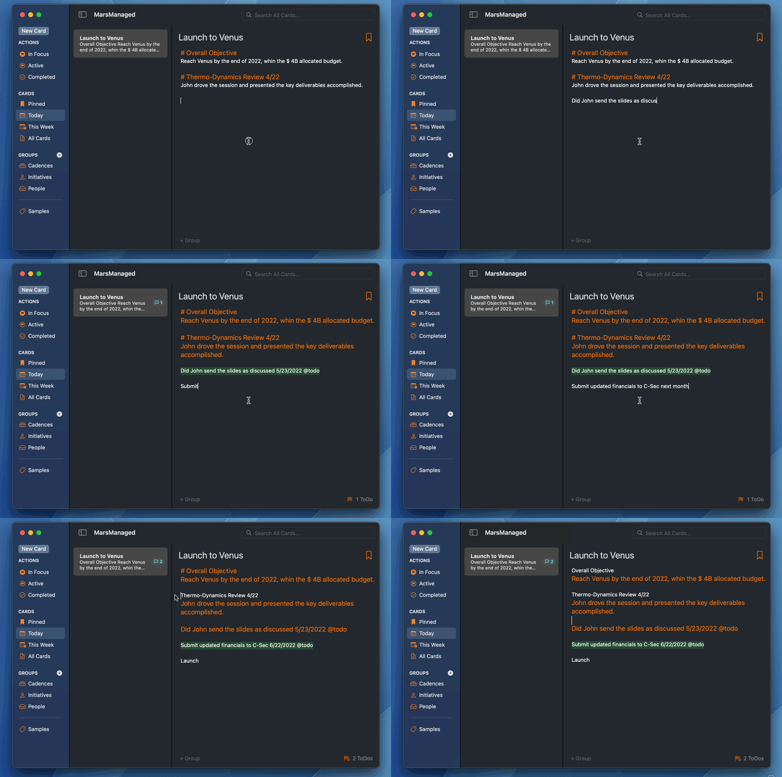
What’s **not** hard to do is cover some of the features added last week. First, based on customer feedback, lots of work around Tags:

     – They can now include a template. If you create a Card while a Tag is selected,  it will default to that template. 

     – Tags can now be pinned, so you can easily access what’s most useful to you. 

     – Tag icons can now be changed, choose from over 100 options. 

Screen Shot 2022 03 13 at 10 18 32 PM

Also quite a bit of work went to the Settings Page. In addition to changing defaults, it allows users to easily modify the templates of Tags. 

Screen Shot 2022 03 13 at 10 22 17 PM

Finally, a lot of under the hood engine improvements for To-Dos. Its **crazy fast**

Screen Shot 2022 03 13 at 10 38 53 PM

Will post more soon to deep dive on the app key features, experience & more. So far the feedback has been very positive, can’t wait to get it in the hands of more users. 

If you’d like to participate in the Alpha -when its ready- do drop me a line at contact@mmvsolucions.com

Marc

SwiftUI macOS Preference Pane | Preferences

As easy as 1, 2, 3. Or is it?

1. Create a new SwiftUI file called PreferencePane and add the desired view within a TabView:

import SwiftUI


struct PreferencePane: View {

    var body: some View {


        TabView {

            Group{

                //ContentsOf the preferences view

                Text(“Profile Settings”)

            }

            .tabItem {

                Label(“General”, systemImage: “gearshape”)

            }


        }

        .frame(width: 500, height: 280)


    }

}


2. In your @main app add the following under WindowGroup:  #if os(macOS)… 

import SwiftUI


@main

struct NameApp: App {


    var body: some Scene {


        WindowGroup {

            SomeView

                .environment(\.managedObjectContext, persistenceController.container.viewContext)


        }


         #if os(macOS)

        Settings {

            PreferencePane()

        }

        #endif

    }

}


3. Compile & enjoy!

Screen Shot 2022 03 09 at 5 34 51 PM

Turns out, it was that easy. Done and done!


Thoughts, suggestions? Reach me @MarcMasVi


Marc

Expanding TO-DO views for MarsManaged

This weekend I continued working on the TO-DO area, specifically on bringing the context-aware functionality of Cards to “Target Date” & “Last Modified” views. 

As most of the code complexities were sorted last weekend, this one I did quite a bit of progress. Here’s the latest:

“Sort by Target Date” view:

Screen Shot 2022 02 06 at 11 04 04 AM


“Sort by Last Modified” view:

Screen Shot 2022 02 06 at 11 04 19 AM

In addition to the above improvements, there’s many other tweaks too. Here’s a few examples:

     – Double clicking on the note title takes you directly to the note the TO-DO belongs to. 

     – TO-DOs will only show Smart Dates (’Today’, ’Tomorrow’, ‘Overdue’) if they have not been completed. 

     – On the ‘Sort by Target Date’ view, dates will not appear on the Overdue, Today or Tomorrow sections.


And finally, worked a bit on the CARD search functionality. Now, when searching, an option appears for you to easily narrow search to the category/tag you have selected.  

Screen Shot 2022 02 06 at 12 57 54 PM

Thoughts, suggestions? Reach me @MarcMasVi


Marc

Working on all new TO-DO views for MarsManaged

This weekend I focused on the TO-DOS view of MarsManaged.

Instead of a list, as I originally developed it, working on having multiple context-aware options. In the example below showing the ’Sort by Card’ one, seems to me this makes this view a lot more useful than a list? 

In light mode:

Screen Shot 2022 01 30 at 8 21 15 PM

And dark mode:

Screen Shot 2022 01 30 at 8 11 21 PM


What you think? @MarcMasVi


Marc

Making an editable Label with SwiftUI

Let’s say you’re showing the user a list of sidebar selectable categories. These categories appear on the sidebar as SwiftUI Labels and, depending on the one selected, the app will show one view or another.

Screen Shot 2022 01 05 at 12 45 24 PM

So far, so good… But what if the user would like to rename one of the categories?

Ideally Label would have a property to allow us to put it in edit mode. However, as of Jan 2022, that property does not exist.

With that in mind, we could pursue one of several options:

     a) Linking to an AppKit / UIKit library

     b) Using alerts

     c) Implementing it using a combination of SwiftUI classes

I went with the latter, as it seemed the cleanest approach. Here’s the result I came up with: 

QuickDemoEditLabel

In a nutshell: it’s a view that by default shows a Label and, when ‘edit mode’ is turned on, becomes a TextView. When the user is done, which is detected by editChanged and commit arguments, changes are saved and the view reverts back to a Label. 

Here’s the code:

struct EditableLabel: View{

    @ObservedObject var tag: Tag

    @State private var editing = false

    @State private var newName: String


    init(tag: Tag){

        self.newName = tag.name.bound

        self.tag = tag

    }


    var body: some View{

        if editing == true{

            TextField(“”, text: $newName, onEditingChanged: {editChanged in

                if editChanged == true{

                    //Focused

                }else{

                    //Lost focus, catches return or when user taps away

                    editing = false

                    tag.name = newName

                }

            }, onCommit: {

                //Catches escape

                editing = false

                tag.name = newName

            })

        }else{

            Label(tag.name ?? “”, systemImage: “tag”)

            .contextMenu {

                Button{

                    editing = true

                } label: {

                    Label(“Rename Tag”, systemImage: “tag”)

                }


            }

        }

    }

}


In the above example the view is connected to a CoreData class, same approach could be used with tweaks to link it to any other model. 

Thoughts / suggestions? You can reach me @MarcMasVi

Until next time, 

Marc

Iterating on MarsManaged Palette & Icon – First Round

With MarsManaged edging closer to feature-complete, today I took some time to start iterating over color palette & icon concepts. 

First, lets talk about the palette:

The premise of the app is that you’ll be as productive as future martian generations will be. With that in mind, when it comes to the color palette of the app, I wanted to start with something Blade-Runner like… 

Thumb 1920 870886

That gives me a combination or oranges and dark grays to work with. There will be cascading problems from this decision, but that’s for another post, for now let’s move right along. 

Designing the first icon:

For inspiration I really liked the image of someone looking over a planet. Something like this:

Iu

From there I dusted off Cheetah3D and PixelMator Pro and got to work on putting something quick & dirty to start with. 

First was the spaceship, a very basic spaceship with some lighting effects would do the trick. The key here, given we’re testing ideas, is to not spend too much time. 

Screen Shot 2021 12 11 at 12 32 19 PM

I’m adding some lighting and reflection so it looks like its orbiting a planet with an orangish atmosphere.

Screen Shot 2021 12 11 at 12 34 31 PM

From there, in Pixelmator I created background using a gradient and some effects to make it look like a planet surface (I settled on something between Mars and the Sun)…

Screen Shot 2021 12 11 at 1 51 48 PM

And then I added the spaceship on top of it.

Screen Shot 2021 12 11 at 12 36 34 PM

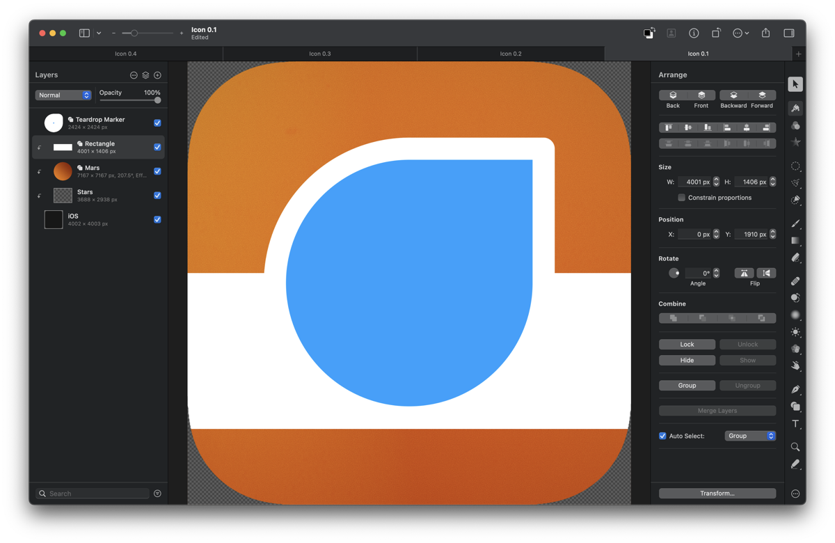
And that resulted in the first rough iteration of the icon.

At this early stage it’s all about testing ideas and iterating quickly.  

Screen Shot 2021 12 11 at 1 00 53 PM

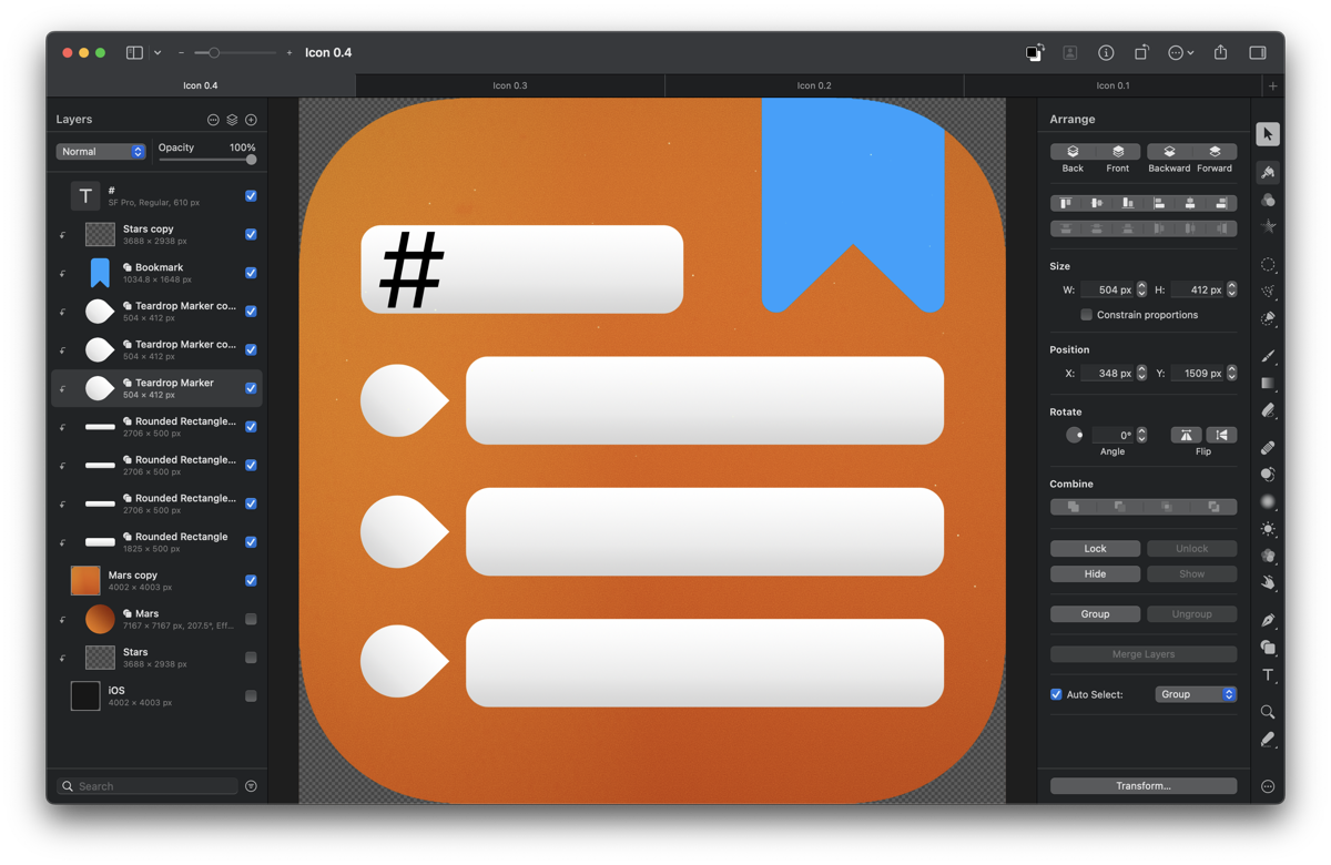
I’m on the fence between going for something fun, using renders, or going for a more serious/flat design…  

Screen Shot 2021 12 11 at 1 32 32 PM

Given the target audience, I’m thinking it should be the latter or a combination of both.

Will take a couple days to think it through and start on the next iteration, let me know your thoughts / suggestions @MarcMasVi

Until next time, 

Marc

Looking back at 3 years of NewsWave

With its retirement approaching, here’s some trivia about NewsWave: 

AppStoreIntro

ONBOARDING 

– 70% of users that downloaded the app ended up creating an account. That was a huge increase from the 20% I was seeing initially. Below the new onboarding flow that premiered with 2020.1 -old icon included-.

Header202010

FEEDS

– NewsWave continuously monitored 4,382 feeds for updates.  

Top followed feeds among users were:


| ORDER  | NAME                      | URL                    |


|    001 | BBC News                  | bbc.co.uk              |

|    002 | CNN Top Stories           | cnn.com                |

|    003 | The New York Times        | nytimes.com            |

|    004 | NPR                       | npr.org                |

|    005 | Reuters: Top News         | reuters.com            |

|    006 | HuffPost – Front Page     | huffpost.com           |

|    007 | 9to5Mac                   | 9to5mac.com            |

|    008 | The Guardian              | theguardian.com        |

|    009 | MacRumors                 | macrumors.com          |

|    010 | Wall Street Journal       | wsj.com                |

|    011 | Washington Post – World   | washingtonpost.com     |

|    012 | TIME | Top Stories        | time.com               |

|    013 | Engadget                  | engadget.com           |

|    014 | Wired                     | wired.com              |

|    015 | BBC Science & Environment | bbc.co.uk              |

|    016 | TED Talks                 | ted.com                |

|    017 | CBC | Top Stories         | cbc.ca                 |

|    018 | Business Insider          | businessinsider.com    |

|    019 | Science Magazine          | science.sciencemag.org |

|    020 | NASA                      | nasa.gov               |


– It would take the server around 600 seconds to crawl & fully refresh all feeds.

– Metadata provided by RSS feeds can’t be trusted, to work around it NewsWave servers used a hash to track changes

– A de-duplication check before any article was added to the database ensured similar articles, with minor title changes or description tweaks, would not be sent again to users. 

– If enough people would subscribe to a feed, the server would then make that feed discoverable by search to other users. That’s great, right? Well, except for adult content…The good news is NewsWave already launched with an explicit content detection algorithm. The bad news is I found myself updating it quite regularly to ensure it caught all variants.  

BOOKMARKS

The average user had 12 bookmarks, in line with my expectations when I designed the system. But there were outliers at >1,500 bookmarked items, leading to some unforeseen synchronization complexities. 

…how much time should you invest on accounting for a use case that will only few users need vs. working on what the majority of users benefit from? Finding the balance is quite tricky, but I’m pleased with the mix achieved. 

USERS

At the time of this writing, NewsWave had 1,955 users and a total of 2,105 devices. The vast majority of users either used the macOS app or the iOS app, the split was:

iPhone: 47%

macOS: 41%

iPad: 12%

REVENUE MODEL

NewsWave had two tiers: a free tier and a premium tier. The objective was to make the app available to as many people as possible, thus the Free Tier aimed for a great experience with minimal server requirements while the premium one added features that had higher server costs. 

Free Tier: Great for users that only had one device, allowed up to 24 fetches/day. 

Premium Tier: Provided unlimited daily fetches and synchronization between any number of devices. 

In retrospective, differentiation between both tiers was not significant enough to motivate most users to move up to the Premium Tier. I had originally planned to show some non-intrusive ads to free users -in a very similar fashion to how Overcast does it– but I never felt NewsWave had enough users to justify all the development it would require. 

KEY NEWSWAVE POSTS (SUNRISE TO SUNSET)

– May 2019 | NewsWave Released

– June 2019 | NewsWave 2019.6 plans

– July 2019 | NewsWave 2019.6 progress

– July 2019 | NewsWave 2019.7

– October 2019 | NewsWave iOS13 Feature Update

– Feb 2020 | 2020 Roadmap

– March 2020 | NewsWave 2020.1

– March 2020 | Designing a new NewsWave Icon

– May 2020 | Announcing NewsWave for Mac

– July 2020 | NewsWave 2020.3 for Mac

– January 2021 | NewsWave for Mac 2021.01

– March 2021 | NewsWave 2021.5 for Mac & iOS

– October 2021 | NewsWave for Mac 2022.0

– November 2021 | NewsWave will be sunset early next year

CLOSING

NewsWave is the app I’m most proud of to date, not only because of the iOS and macOS apps, but also because of the server-side components: php, python, sql, Debian… I had a blast learning & building the crawler engine, the synchronization logic, the maintenance scripts… 

Ultimately thought, it was its time

Next post will be about the future, very excited about the new apps & services in the pipeline.

As always, you can reach me @MarcMasVi

Marc