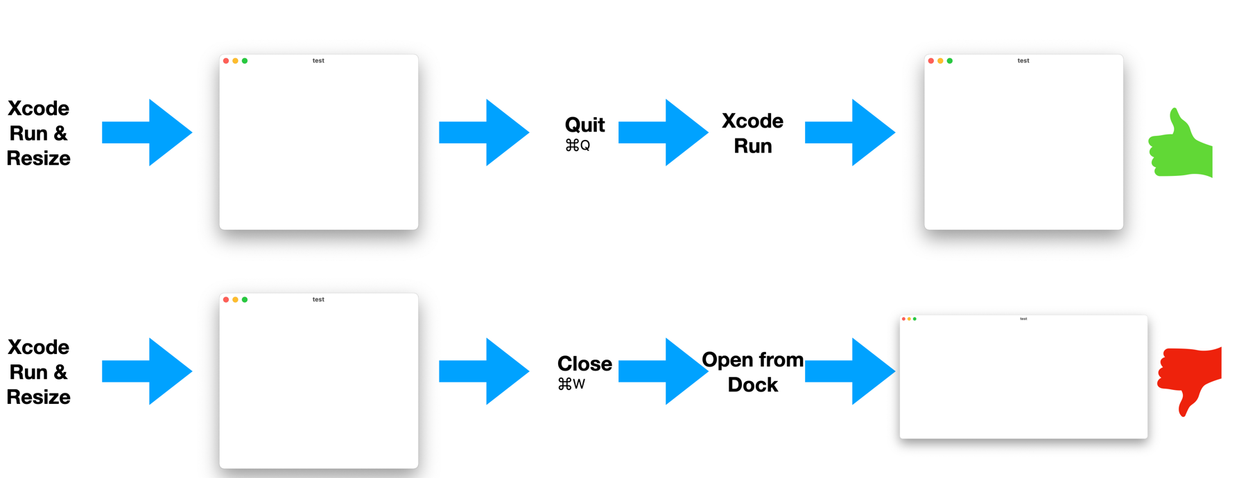
Enabling undo CoreData + SwiftUI

I did a post a while back about how to enable undo functionality when using CoreData. It continues to work great for AppKit or UIKit apps, but what about if you’ve adopted SwiftUI as Apple is suggesting we do?

BestWaySwiftUI

Well… unfortunately the previous approach won’t work quite as well.

After a few hours working this, it turns out it’s quite simple… You have two options:

1. Using the @Environment property:

First, be sure you pass the right managedObjectContext to your top level view as part of the @main App:

    var body: some Scene {

        WindowGroup {

            someTopLevelView

                .environment(\.managedObjectContext,container.viewContext)

        }

Then, in the SwiftUI file where you want to add undo functionality you’ll add the  following @Environment properties

//CoreData convinience

    @Environment(\.managedObjectContext) private var viewContext

    @Environment(\.undoManager) private var undoManager

And then you’ll connect them, ensuring the SwiftUI undoManager is connected to the one you’ve created:

    someView

    .onAppear{

        viewContext.undoManager = undoManager

     }

Voila!

2. Alternatively you can implement your own Undo/Redo Commands in SwiftUI:

    .commands {

        CommandGroup(replacing: .undoRedo) {

            Button(“Undo”) {

                //Trigger  your own undo with your created undoManager

                undoManager?.undo()

            }

            .keyboardShortcut(KeyEquivalent(“z”), modifiers: [.command])

            .disabled(undoManager?.canUndo == false)

            Button(“Redo”) {

                //Trigger  your own undo with your created undoManager

                undoManager?.redo()

            }

            .keyboardShortcut(KeyEquivalent(“z”), modifiers: [.command, .shift])

            .disabled(undoManager?.canRedo == false)

        }

    }


And that’s it, now you have full undo functionality for Core Data in SwiftUI. 

Questions / comments? I’m at @MarcMasVi 

Marc

SideBar: The Silent Super-Feature

If done right you will almost never notice it.. It is however one of the most used parts of any app: the sidebar. 

With MarsManaged we’ve gone through quite a few iterations. Here’s a retrospective on the improvements made, and the thinking behind them. 

Sidebars

First Iteration (A): Although it was purely a SwiftUI non-functional prototype, the sidebar already contained all the key elements that would define the app -> notes, tasks and tags. 

Second Iteration (B): To show notes are much more than just text and to indicate intent, Notes are renamed to Action Cards. For the first time we’re also including the concept of Categories, essentially non-deletable Tags.  Finally Tasks is renamed to To-Dos as it reads better.

Third Iteration (C): Minor tweaks here, Action Cards is simplified to Cards and Categories is moved below To-Dos. The reasoning being Tags and Categories should appear at the bottom as they group above elements. Another addition is the button to add a Tag from the sidebar, allowing users to quickly create new ones.

Fourth Iteration (D): A visually minor but significant change, categories no longer exist as their own element. They have now become regular Tags. Pinned ones to be precise. Pinned tags is a new feature where any tag can be pinned to appear above non-pinned ones, separated by a thin line. 

Fifth Iteration (E): As To-Dos are linked to Cards, and Cards are linked to Tags, the order in which they appear on the sidebar is changed to reflect this functional reality (1. ToDo < 2. Card < 3. Tag). Two other changes you’ll notice is that, based on user-testing feedback, Tags is now called Groups and To-Dos has been renamed to Actions, better matching the app theme and showing intent.

Sixth Iteration (F): The New Card and New Action buttons are moved to the Toolbar, freeing the SideBar to only focus on the user content and giving MarsManaged a cleaner look.  

Which takes us to today’s (and probably final) iteration-> Seventh Iteration 

NewImage

6th iteration on the left, 7th on the right

First, the cosmetic changes:  In Focus has become simply Focus and This Week has become Recents.

Second, the Today section is no longer available: although initially I thought it would be convenient for users, the reality is that I was wrong. Today would always be empty at the beginning of the day so users would end up always skipping Today and going to Recents instead, even when they wanted to see Cards they edited today. 

So, here you have it, the evolution of the SideBar over almost a year, one of the most important parts of MarsManaged. What are your thoughts, anything I have missed? Let me know @MarcMasVi

Happy coding,

Marc

MarsManaged July Update: New Palette, Icon, UX Improvements…

Back in Sunny California!

Portugal was great: the food, the weather, the people… In between hikes, museums and reading breaks I’ve done quite a bit of progress on MarsManaged: it’s looking better and better. Every day a bit more polished and user feedback is helping raise the bar big time.

Here’s how the main screen looks like now:

Screen Shot 2022 07 26 at 4 26 03 PM

And here’s how it looks when a Card is selected:

Screen Shot 2022 07 26 at 4 26 11 PM

Finally, as you may recall previous attempts were not satisfactory (to say the least) here’s the latest iteration of the icon: 

Icon

If you want to be part of TestFlight and help shape the future of the app, drop me a line at contact@mmvsolucions.com

Thoughts, suggestions? Reach me @MarcMasVi

Marc

Bom Dia

I’m writing these lines from a wonderful terrace overseeing Guimaraes, a small medieval town in Portugal. 

The day is sunny, there’s a refreshing breeze and -behind me- a fountain provides background noise perfect for focusing. 

IMG 2856

As you may have guessed, I’m on vacation. My wife and I have taken two weeks to visit Portugal, enjoy its cuisine and -of course- read and code. 

The book I’m reading at the moment is Build, by Tony Fadell. It’s an excellent book, a wealth of product experience condensed to its essence. He does not beat around the bush, delivers at every page. 

Nyt the book forward slant

Coding-wise, I’m continuing to work on polish and bug-fixing while keeping impulses to add more features to MarsManaged at bay. I won’t lie, this final phase is not as rewarding/stimulating, it is however necessary to ship a reliable product so powering through it. 

Also, the app icon… I’m playing with different concepts, I’m not entirely happy with any yet. Here’s one option:

Screen Shot 2022 07 11 at 11 07 47 AM

I like the fact that its easily recognizable and scales well to multiple sizes. I do not like that it does not reflect the functionality of the app in any way. 

Here’s another:

Screen Shot 2022 07 11 at 11 08 27 AM

On this one I like that it shows the functionality of the app. However I do not like that it does so poorly and that it does not scale well to multiple sizes. It’s too crowded too. OK, I agree, this one is horrible. 

More to come as I keep iterating.  

Thoughts, suggestions? Reach me @MarcMasVi

Marc

– – –

P.S. After so many holidays at home due to COVID its so refreshing to travel again, I missed this so much. 

Supervised Machine Learning – Andrew Ng

If you’ve always been on the fence about learning Machine Learning but the concepts seemed too intimidating, Andrew Ng has created a new and improved version of his introduction to Data Science. You can find it here

I did the original one and it was so good, this one seems to be even better. And all in Python!

There’s never been a better time to learn, or refresh, your ML skills. 

Thoughts, suggestions? Reach me @MarcMasVi

Marc

Replacing NSTextView text programmatically without affecting its style and format

In the previous post I discussed the addition of Dynamic Date parsing to MarsManaged. In a nutshell: actions containing certain keywords (i.e. today, tomorrow, next month) are automatically converted to target dates. 

High level, the flow is as follows:

Screen Shot 2022 05 28 at 12 00 43 PM

Nice right? Well, I quickly discovered an unexpected surprise: the TextView format was being lost when the keyword replacement happened.

BugReplacement

After some digging I found the culprit ->  textView.string.replaceSubrange([…])

Every time that line of code was called, TextView would lose its attributed format.  

To deal with this, I initially considered reformatting the CARD every time a keyword was replaced. That would work of course, but it’s not clean nor efficient… Thankfully, after some digging, found a better solution to the problem by using textStorage attribute instead of string. That completely prevents the loss of format, so no need to do anything else.  

Updated replacement code -> textView.textStorage!.replaceCharacters(in: […]) 

And here’s the result:

LaunchToVenus32

Thoughts, suggestions? Reach me @MarcMasVi

Marc

Schedule & re-Schedule any action with Dynamic Date parsing

One thing is clear when launching a Product: timelines will change. 

To handle all these changes with ease, MarsManaged now includes Dynamic Date parsing*. Just type the target date in your own words and MarsManaged will do the rest.

Here it is in action: 

LaunchToVenus2

Here’s some examples of keywords you can use:

  • today (i.e. Did John send the minutes as discussed today @todo )
  • tomorrow 
  • this week
  • next week
  • thursday
  • next Friday
  • May
  • next month (i.e. Submit updated financials to C-Sec next month @todo )
  • next October
  • this year
  • next year

And, of course, once a date has been set you can change it directly in text or using the built in calendar popup (yes, that’s new too!). 

LaunchToVenus3

Everything is kept in sync: the ACTION date, the ACTION text and -of course- the CARD its linked to. 

Screen Shot 2022 05 22 at 9 27 31 PM

With this superpower there will not be more missed timelines, only changed timelines. Now, that’s how you make a Product Manager successful!


For users in TestFlight, the new beta should be rolling out very soon. If you want to be part of TestFlight and help shape the future of MarsManaged, drop me a line at contact@mmvsolucions.com

Thoughts, suggestions? Reach me @MarcMasVi

Marc


* yes, I totally made that name up. 

Adding an overlay when there’s no content to show – SwiftUI Empty States

Empty states. Or to put it another way, what do you show when a view is devoid of any content? 

This is an area that not all apps account for. The ones that do though, not only improve the end-user experience but also feel more… complete? 

Here’s some examples of empty states.

1. NetNewsWire (a great RSS reader that I use daily): 

Screen Shot 2022 04 16 at 12 53 53 PM

2. MarsEdit (my blogging app of choice):

Screen Shot 2022 04 16 at 12 53 20 PM

3. Evernote has a different style, showing also an image and a button to trigger next steps:

Screen Shot 2022 04 16 at 1 02 19 PM

4. Finally, here’s how Apple Notes approaches it:

Screen Shot 2022 04 16 at 2 44 14 PM

For MarsManaged I decided to go with a similar approach to Apple Notes when the card list is empty. Here’s how to easily do it in SwiftUI. 

1. Create a ZStack where you’ll have a list of items you want to show followed by your desired empty state view, in this case I’m using Text. 

2. Set the State View opacity to 1 if there’s no data to show or 0 otherwise. In doing so the view will only appear when there’s nothing to show. 

ZStack{

    List(){

        ForEach(notes){note in

                //Stuff […]

            }

        }

    Text(“No Cards”)

        .font(.title)

        .opacity(notes.count == 0 ? 1 : 0

}

In addition, to help infuse some character into the app I’m planning on having quotes related to space exploration/mars in the detail view. Maybe also some image of Mars? Have not decided yet… Do let me know what you think. 

Screen Shot 2022 04 16 at 2 58 53 PM

Development-wise it’s even easier: using an if statement it checks if a Card is selected and if so it’ll show the editor, else it’ll show the empty state view.  

Thoughts, suggestions? Reach me @MarcMasVi

Marc

Creating a macOS “About” screen the SwiftUI way

If you’re creating a macOS app, the About screen is that place where you get to “sign” your work. It is also the place where most developers will link to their personal web, thank contributors, etc. 

For me, it’s one of the areas I work on last… When I get to it, it always feels great. 

And here’s one of the areas where leveraging SwiftUI pays big time. It could not be easier:

1. In Xcode Create a new file and choose “Rich Text File”

Screen Shot 2022 04 05 at 11 09 31 AM

2. Name it “Credits”

3. Select the file you’ve just created and add the text you want. Be sure to center it. 

Screen Shot 2022 04 05 at 11 21 34 AM

4. Compile & Run

Screen Shot 2022 04 05 at 11 21 50 AM

That’s it, happy shipping! Thoughts, suggestions? Reach me @MarcMasVi

Marc


PS. Here’s the link to Apple Documentation

Badges? Gray Badges? Color Badges!

As I was working on cell badges indicating the number of to-dos pending for a given card it hit me… 

 The approach I was taking was good, it gave relevant and timely information…

MarcMasVi 2022 Apr 02

But could be much better: what if the flag changes color when you have a to-do overdue, due today, tomorrow or soon?  

This would, without increasing complexity, add context and allow the user to focus on what matters.  Furthermore, I could use the same split & colors already in use for to-dos, making it extremely accessible:

Screen Shot 2022 04 03 at 10 06 57 AM

Got to work, and a couple hours later, voilà:

Screen Shot 2022 04 02 at 9 08 09 PM

Quick aside for interested fellow engineers, this is pure SwiftUI. When the cell is loaded, a model helper function determines the number and color of to-dos. SwiftUI takes care of the rest and dynamically shows the right thing. 

Finally, if no to-dos exist for that card, no badge is shown. So, if you see no flags, you’re all done!

* * *

Here it is, in all its glory:

BadgeTodoitled1

* * *

On a side note, although I believe this to be a better experience for most users, some may prefer a cleaner aesthetic. For them I’ve added a preference toggle so they can disable them.

Screen Shot 2022 04 03 at 10 47 30 AM

* * *

At this point the app is almost feature-complete, I’m fully focused on polishing towards alpha -a very polished alpha that is-. If you’d like to be part of the test group do drop me a line at contact@mmvsolucions.com, would love your feedback.

Until next time! Thoughts, suggestions? Reach me @MarcMasVi

Marc