Working on new NLP projects

After shipping NewsWave for Mac, this last few weeks I’ve been playing around with two new NLP (natural language processing) projects. Each quite different from the other:

The first is targeted at the corporate world, its focus is in identifying new trends and winning themes based on RFP’s (requests for pricing) submitted by clients. This will be specially useful to help sales teams focus on the right requests & increase win rates.

The second one is about identifying sentiment & anger intensity in news / blog posts. This may translate into a NewsWave feature. Many outlets use anger to boost engagement, what if there’d be a way to keep that in check -while getting the content you need-? 

I’m having a blast with both, you never know with these projects, but I’m aiming to complete them by the end of July. I’ll keep you posted as things evolve. 

On another note, the release of NewsWave for Mac went well, I’m planning a longer post with more details about it. 

Until next time, 

Marc

Announcing NewsWave for Mac!

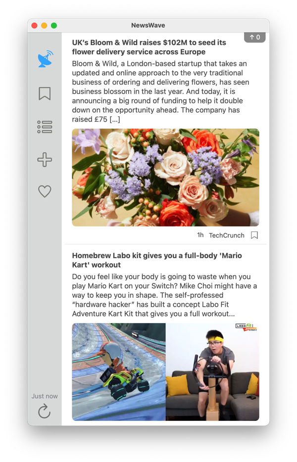
Without further ado, NewsWave for Mac is available on the Mac App Store.

Create your own timeline of stories by following your favorite feeds. Now from your iPhone, iPad or Mac.

Stacks image 307ce4a

What differentiates NewsWave?

– Twitter style timeline of your personalized content.

– Easily discover feeds through categories or catalogue search.

– Streamlined experience that makes browsing your stories fun & engaging.

What is the business model?

A premium subscription enables sync between your devices and allows unlimited content updates. It’s $ 9.99 / year.

The free version gets hourly updates and does not feature sync.

Can I try the synchronization between devices before I subscribe?

To keep accounts anonymous there is no personally identifiable information needed to create an account. The downside is that for NewsWave to know ‘you’ across devices it uses the subscription app purchase.

Where does the app idea come from?

It’s inspired by Brent Simmons, Marco Arment & Dave Winer.

I don’t like NewsWave

There’s other great alternatives out there, here’s a couple:

– NetNewsWire: https://ranchero.com/netnewswire/ 

– Reeder 4: https://reederapp.com

– Unread: https://www.goldenhillsoftware.com/unread/

I have feedback / Something does not work as expected

Feedback is welcome! Although I can’t reply to all emails I do read them all. Please do reach out at contact@mmvsolucions.com or hit me @MarcMasVi on Twitter.

– – – – –

I sincerely hope you’ll enjoy NewsWave. I have many ideas to keep improving it, will post here as development progresses.

Thanks & stay safe,

Marc

Creating a Digital Gardener | Home Automation – Raspberry Pi 4

Last December my wife and I flew to Europe to spend a couple of weeks with our overseas family. Although we live in a very safe neighborhood, for peace of mind, we wanted a way to check on our house while we were away.

There’s a couple of good commercial options, but they are a bit limited on what they do. So, I got myself a Raspberry 4, a couple sensors and a case and got to work. There’s a lot of great information online and I got a first digital guard prototype working quite quickly: 

IMG 4930

If the digital guard detected movement or any open doors it would start recording, open house lights, play sounds -pretending someone was in the house- and notify us. 

If everything was well, and nothing abnormal was detected, it would send a daily report with a picture of the house, inside temperature, humidity and more. Was the digital guard overkill? Likely… Fun to create & successful at its objective? Absolutely! 

Fast forward to a couple months ago and, due to the new COVID situation, my wife and I started getting into gardening.

We really liked adding plants to our garden, seeding, seeing the plants grow… One thing that sometimes was not as fun though was watering. Don’t get me wrong, its great when you want to do it, but having to do it daily can be tedious. Perfect excuse for a digital worker addition to the house: the digital gardener.  

As for the tools the worker would use, after doing some research I settled on two small sprinklers, connected using in-ground tubing and controlled by a solenoid valve. The valve, in turn, would be connected to a smart plug that was controlled by the Raspberry 4 through WiFi. 

IMG 3067

Assembly was quite straightforward. One thing I’d have loved someone told me: make sure you add quite a bit of sprinkler pipe thread seal tape in every connection. Specially on the ones that come before the solenoid valve acts. 

OK, now that I had everything ready to go I started working on the digital gardener itself. As a gardener would do, I wanted that every day it would assess how much water the plants needed. To allow him to do its job, the digital gardener needed the following information:

a) Did it rain today over my house? If so, how much?

b) What was the average temperature today?

c) How wet was the soil? 

Then, it should use that information to decide how much water the plants needed and start watering. Quick & easy.   

Translating to actual implementation:

1. In the Raspberry 4, crontab triggers the digital gardener (python script) every day at 8 p.m. 

2. The digital gardener pulls from OpenWeatherMap API the exact weather over my house using lat and long coordinates. 

3. It then decides the amount of time that it should water the plants for, or if it should water at all, based on rain and temperature specifics. 

4. It connects to the smart plug and turns it on, in turn this opens the solenoid valve and watering starts. 

5. Waits until the timer is up. 

6. Connects to the smart plug and turns it off, closing the solenoid and stopping watering. 

Throughout this process the worker is logging everything that is doing on a text file. I can then review what it did and tweak its behavior as needed. 

I also added a couple safety nets for when things could go wrong, if the connection to the smart plug fails when turning it on it will try again a couple of times before giving up. If it fails when turning it off it will keep trying every few minutes until it succeeds. 

And that’s it, I assembled the Raspberry inside an electrical box and placed it where it can act as a Digital Guard -if activated- and as a Digital Gardener -daily-. I’ve not yet soldered the components, excuse the electrical tape:

IMG 5622

And voila! Now we can go back to choosing the right lawn grass 🙂 

IMG 5611

– – – – – –

Today it’s been a very hot day for Palo Alto standards, 95 F. Do I need to remember to go out and water the plants? Of course not, the digital gardener has my back and will water the precise amount they need (unless I messed up the instructions, but that can always be fixed 🙂 ).

Until next time,

Marc 

Designing the new NewsWave App Icon

One of the things I like about working on on-the-side projects is that I touch all aspects of them, this allows me to learn and grow many different skills. It’s so rewarding to learn about app development, server-side development, marketing, communication, design… 

And it’s the latter one I wanted to touch on for this post, specifically the NewsWave App Icon. Before we begin let’s clarify something very important: I’m not a Designer (as it will soon become aparent).

With that out of the way, lets see how the previous NewsWave for iOS icon looked like:

Icon


What defines success for an app icon you ask?

 – Should be easily recognizable on your iPhone home page & when it appears smaller for search or notifications. 

– Should look great when it appears in large size, like above. 

– Should work as a tab-bar icon (iOS) or a sideBar icon (Mac) with minor tweaks. 


The NewsWave 1.0 icon -shown above- met the objectives #1 and #3, but when it came to #2 it was decent at best. For the upcoming release of NewsWave for iOS & Mac I wanted to have an improved version, so I got to work…

I knew what I wanted to keep: the antenna metaphor and a color combination of blue & gray. I also knew what had to change: the antenna was bland, specially when seen at large sizes, and the icon did not translate well to the mac. 

The first thing I did was choose a picture I could use for inspiration, here’s the ‘cleaned’ one I settled for:

Screen Shot 2020 05 23 at 09 21 09

Once I had that, I worked on a first rough version of the icon:

Screen Shot 2020 05 23 at 09 23 12

and added background & other distinctive features:

Screen Shot 2020 05 23 at 09 24 50
As a first iteration I liked it OK, but it was quite bland. So, I started iterating with different gradients, antenna inclination angles, shadows, distinctive features…

After every iteration I would load it in the App bundles so I could see how they appeard on my Mac and on my iPhone. Would also look at how they looked when using Spotlight, notifications, etc… This step is critical because something that looks great at large size may look awful at small sizes. 

Here’s an example of another iteration, I knew it looked wrong but was difficult to know what to do to fix it. 

Screen Shot 2020 05 23 at 09 28 17

When you’re in this iteration circle, sometimes it can feel like you’re not moving forwards but backwards… Going for a walk or working on something else for a while helps big time. 

And after one of this walks it hit me, what if the icon represented an antenna at night pointing at the stars? This led a series of follow up decisions: removing borders, adding a representation of the ground, changing colors, adding new filters… And very quickly got to the final version, for Mac:

Screen Shot 2020 05 23 at 09 29 20


and for iOS:

Icon443


I’m quite happy with how they turned out. At the same time I know there’s a lot that a full time designer would do better, and that’s one of things I love about this one-man-operation, you just keep learning & getting better. 

As for the software I used to create the icons, it’s “Pixelmator Pro” and I can’t recommend it enough. 

Comments / questions?  You can reach me @MarcMasVi on Twitter.

Until next time, 


Marc

Cliffski on Social Media

I have followed Cliffski, founder and solo developer at Positech Games, for many years. He’s quite opinionated and his last post is no exception:

“ […] In 2020, the internet is an absolute cesspit, bringing out the absolute worst in human behavior. Its almost impossible to enjoy surfing the web without being sucked into social media. Every site wants you to log in with your social media usernames, so you can be tracked, analyzed, categorised and above-all, monetized. Clearly at some point, someone realized that the one thing that keeps people online (and thus seeing ads) was anger. Anger is the ultimate emotion. Get people angry and they will keep posting, retweeting liking, replying, hating. […]”

https://www.positech.co.uk/cliffsblog/2020/05/03/on-social-media/ 


Interesting read,


Marc

Time until next day starts in UTC (Swift)

Although users interact with NewsWave on their iOS and -soon- Mac, some features are provided by a server.

So, how can I let users know when the server triggers certain tasks? If they are triggered at regular intervals you can simply calculate on the device how long until it will be triggered again. This reduces calls to the server, which in turn reduces cost.

In this example, the function calculates how many hours until the next day -in UTC timezone- starts:

var calendarIso8601 = Calendar(identifier: .iso8601) // Gregorian calendar, which “serves as an international standard for civil use.

calendarIso8601.timeZone = TimeZone(identifier: “UTC”)!

let startOfDayTodayUTC = calendarIso8601.startOfDay(for: Date()) //Start day at UTC

let endOfDayTodayUTC = Calendar.current.date(byAdding: .day, value: 1, to: startOfDayTodayUTC)

let secondsToTomo = endOfDayTodayUTC?.timeIntervalSince(Date())

let hoursToTomo = secondsToTomo!/60/60

The app can then show this number to the user. 


Marc

NewsWave for Mac – Dark Mode

NewsWave for Mac is moving along quite well. In fact, 1.0 is feature complete, meaning all features I planned to ship in the first Mac release are already in. I’m now focusing on testing and polish. 

Speaking of polish, here’s a couple screenshots of the -mostly- final version of Dark Mode, updated icons and all 🙂  Let me know if you have any feedback. 

Screen Shot 2020 05 06 at 16 39 30

Screen Shot 2020 05 06 at 16 39 36

Screen Shot 2020 05 06 at 16 39 46

While working on the icons I’ve used Pixelmator Pro for the first time, I’ve been blown away by how good and fast it is. In the past I used Acorn and the standard Pixelmator and… Oh my oh my. Pixelmator Pro is AMAZING. 

Back to NewsWave, I’ll keep you posted on progress, can’t wait to share it with all of you. 

Marc

Making Sense Podcast #201 Yuval Noah Harari

One of the podcasts I typically follow is “Making Sense” by Sam Harris. I found his latest episode, where he had a discussion with Yuval Noah Harari especially insightful. 

“[…] They discuss the failures of global leadership, the widespread distrust of institutions, the benefits of nationalism and its current unraveling in the U.S., politics as a way of reconciling competing desires, the consequences of misinformation, the enduring respect for science, the future of surveillance, the changing role of religion, and other topics.”

Here’s a link to the episode if you’re interested. 


Marc

Create a NSButton in code (swift)

Some time ago I shared a simple way to create custom UIButtons in code. As I’m starting to polish NewsWave for Mac, I wanted the same ability to easily create custom buttons. So, I ported the function to macOS, feel free to leverage:


    func createNewNSButton(title: String, textSizeDelta: CGFloat?, textColor: NSColor?,  backgroundColor: NSColor?, cornerRadius: Bool, cornerColor: NSColor?) -> NSButton{


        let button = NSButton()


        button.translatesAutoresizingMaskIntoConstraints = false

        button.attributedTitle = NSMutableAttributedString(string: ”  \(title)  “, attributes: [NSAttributedString.Key.foregroundColor: (textColor ?? NSColor.white), NSAttributedString.Key.font: NSFont.systemFont(ofSize: (NSFont.systemFontSize + (textSizeDelta ?? 0)))])


        button.isBordered = false

        button.wantsLayer = true

        button.layer?.backgroundColor = backgroundColor?.cgColor ?? .clear


        if cornerRadius == true{

            button.layer!.masksToBounds = true

            button.layer!.cornerRadius = 22

            button.layer!.maskedCorners = [.layerMaxXMaxYCorner, .layerMinXMaxYCorner, .layerMaxXMinYCorner, .layerMinXMinYCorner]

            if cornerColor != nil{

                button.layer!.borderWidth = 2

                button.layer!.borderColor = cornerColor!.cgColor

            }

        }


        return button

    }


And to add an action you just:

button.action = #selector(whateverActionGoesHere)

Here’s an example of the types of buttons you can create:

Screen Shot 2020 04 04 at 16 49 02

Stay safe & until next time,


Marc

—-


Twitter -> @MarcMasVi

NewsWave 2020.1

There’s many things that have changed since social distancing began about 15 days ago: meeting friends, going for morning coffees, weekend escapes and many other activities are now on hold. However, there are also some positive consequences: my wife and I have really gotten into board games (Forbidden Island, Exploding Kittens, Scrabble…), I’ve gotten a lot better at cooking and, probably the most relevant for this blog, I have significantly more time to code on weekends, so… NewsWave 2020.1 is now live! 

Header202010

NewsWave 2020.1 is a major update. In a nutshell it improves the onboarding experience and builds the foundation for the upcoming macOS version.

Here are the key changes in a bit more detail:

1. Onboarding:

This was the area the app that needed more work on and I’m very happy with the result. To recap, this is how it used to work:

“when you launch NewsWave RSS for the first time, you’re asked to create an account or restore an existing one before you can interact with the app. For privacy & simplicity reasons I do this with a free IAP.  Behind the scenes, when a user unlocks a free in-app-purchase (IAP), Apple provides me with a uniqueUserId I use to identify the customer. This allows me to grant the customer a 30 day free trial, allow him to try sync and easily migrate him to a Premium account if he so chooses. “

The new model is much simpler, users can create an anonymous account with the click of a button. When a new user downloads NewsWave, a new device-specific token is created for him, no emails, no IAP, no complexity. 

You may have spotted a significant downside vs. the old model. As the identifier is tied to the device, and because there’s no personal information shared, if the user deletes the app the device-token is gone too. What this means in practice is that if the user re-downloads the app, he would need to create a new account.

Wow! Big downside. Well, yes, and no.

Once the user becomes a subscriber, his device token is linked to the in-app-purchase (IAP) identifier. From then on he can restore his account from any device by tapping “Restore”. This is true even if the user is no longer subscribed. 

Therefore, the only time this could lead to a potential challenge is for users trying the app. Given that it’s only 30 days, and that they would need to remove the app, I’m confident the upside is a lot more significant than the potential downside. 

A final consequence of this changes is that the onboarding UX is significantly more streamlined. Here’s the new page:

Screen Shot 2020 03 29 at 18 54 05


I believe there will be significant impact on conversion-rate, which was the key challenge of the app in the past. I’ll keep you posted on how it changes. 


2. Default Feeds:

In the old model, once a user had created an account, they were taken to the “Feeds Section” and guided to start adding feeds. This was not a great first experience, and if the user tapped away from the “Feeds Section”, he would not be able to interact with anything as there was no content to show… Not great. 

In the new model, when a new user is created, he is automatically subscribed to a few starting feeds. Once the initial setup is complete, he is taken to the main screen -already populated with content- where he can start using the app. A huge improvement vs the past. 

This change resulted in something else, I had to choose these starting feeds. 


Default feeds should:

– Touch a variety of fields/subjects. 

– Be free to access (or have generous free access policies).

– Provide a good RSS summary and image to go along with the posts. 

– Post enough but not too much, ideally 5 to 20 times per day. 

– Represent both mass appeal and niche feeds. 


Here’s what I settled on:

1. Daring Fireball (Blog – Apple)

2. Six Colors (News – Products/Apple)

4. Ars Technica (Technology)

5. Vox (General News)

6. Mr. Money Mustache (Blog – Personal Finances)

7. The Intercept (General News & Reporting)


3. Synchronization & under the hood improvements:

It’s no secret I’m working on the macOS version of NewsWave.

To prepare for its upcoming release, I’ve invested a lot of time on refining synchronization between devices. All calls now use one streamlined framework, which makes testing a lot simpler and reduces the likelihood of bugs. 

Finally and most importantly, today both iOS and the macOS versions of NewsWave share the same API back end code, this dramatically simplifies the effort needed to update and improve the apps.   


4. Other improvements:

There’s been many other refinements and under the hood improvements, including:

– Improved wording on several menus and notifications. 

– Improved saving & loading speeds for users with large amount of feeds. 

– Removed redundant code (I love this part, love it!). 

– Fixed a bug that, under rare circumstances, could show a black NavBar. 

– Updated Feed Recommendations. 


I’ll be monitoring the servers to make sure everything is going well. With this milestone out of the way, I’ll be fully focusing on NewsWave for Mac from now on. Hopefully will be able to ship sooner than  the original 2020 plan 🙂

I believe this will be a great year for RSS, if you’re not yet a user give NewsWave a try! And if you don’t like it, there’s other great options out there. 


Stay safe & until next time,


Marc

—-


Twitter -> @MarcMasVi